Saturday, 6 May 2017
Monday, 1 May 2017
Sunday, 30 April 2017
Evaluation
Finishing my Evaluation

I completed my evaluation on PowerPoint. It has a total of 21 slides and covers all seven questions.

Technology 4
Technology I used to create my music magazine: Adobe InDesign
 To actually create the format and layout for my magazine, I used Adobe InDesign CS4. I learned the basics of indesign, such as making frame and placing edited photoshop images into the doucument.

To actually create the format and layout for my magazine, I used Adobe InDesign CS4. I learned the basics of indesign, such as making frame and placing edited photoshop images into the doucument.
Technology 3

Technology I used to create my music magazine: Adobe Photoshop
To edit my photos I used Adobe Photoshop CS4. Over a few weeks, we learned how to remove backgrounds, clone stamp patterns/colours, blend and put filters on out photos.

Technology 2
Technology I used to create my music magazine: Camera Equipment/Studio
This is the photo studio I used to take some of my pictures. It includes studio lights, with softboxes and an umbrella. We were talked through how to use the studio space efficiently a few weeks prior to taking the photos, and I learned how to use the lights and remotes.
Technology 1
Technology I used to create my music magazine: Camera

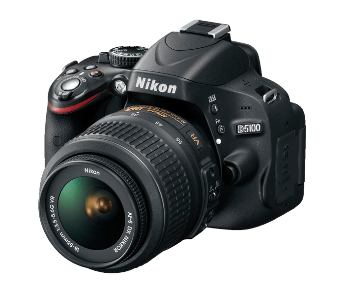
To take my pictures, I used a Nikon D5100 camera, which is a DSLR. It has many features that need to be considered when taking a photograph. I learned about aperture and shutter speed and how they affect the light the camera lets in.
Thursday, 27 April 2017
Final Cut vs. Rough Cut 3
Comparing my rough cut to my final cut: Double Page Spread

The main difference between my rough cut and the final cut is the photo. In the rough cut, I erased the background of my photo, which made it look messy and unconventional. However, for my final cut I took photos on location. I am much happier with the way the location looked compared to the photoshopped pictures, as it looks a lot neater, as the only way I edited it was to increase the contrast/brightness a little.
I added an introduction onto the end of my byline, just to explain what my article was actually about. I made the title larger, so it would attract more attention, and I lowered the font size to 11 pt, meaning I had to write more. I changed the embossed quote from uppercase to lower case, so it would match with the article a little better, and I made the page number smaller and made sure to only put it on one side.
Questions for my Interview
Questions for my Interview
Q: Your debut album was a huge success. How have you dealt with the response?
I chose this question to start off to set the tone of the article. It shows that the writing is going to be concentrated on the music rather than the artist themselves.
Q: Your debut album was a huge success. How have you dealt with the response?
I chose this question to start off to set the tone of the article. It shows that the writing is going to be concentrated on the music rather than the artist themselves.
Q: Do you think your new album sounds different from your first?
This question follows the conventions that I found in my research.
Q: And what would you say those influences were?
Again, the question is focused solely on the music, therefore attracting my target audience.
Q: What do you think makes you stand out from the rest of the bands trying to ‘make it big’?
I chose this question as it would be interesting to fans.
Q: Speaking of fans, you guys are known for being really down to earth with them- on social media and in real life- how do you keep your feet on the ground so well?
I thought that this would attract my demographic as it makes it seem like my 'band' cares about the fans- as my genre, alternative, is very fan-focused.
Q: What do you all think has been the proudest moment of your career so far?
Brings in a more personal vibe to the article, whilst still maintaining a sense of reliability and staying away from idolising the musicians.
Q:Have you always known you want to do this or was it a bit unexpected?
A general question I found in my research.
Q: You guys have been on tour a lot since your first album was released-where’s your favourite place to tour?
Adding a personal edge to a vague and easily answerable question.
Q: Finally, where do you hope to be in 5 years?
I decided to use this question as I thought it would be a nice, rounded way to finish the 'interview'.
Wednesday, 26 April 2017
Researching Articles- Questions
Researching articles
I looked through some of my music magazines that I had at home, and some of the ones that were at school to research what sort of questions bands or artists usually get asked in interviews.
I found out that most of the questions for the genre that I am doing, alternative, are quite general and vague, directing the attention on the artists' music or upcoming tours rather than the artist themselves.
Examples include:
- "What are your favourite tracks on the album?"
- "What's the best memory from this tour?"
- "Can you see yourself doing this in a few years time?"
The interviewer tends to stay clear of more personal questions that you're more likely to see in a pop music magazine or even a gossip magazine. For example, in my research I never came across a question like, "Are you dating anyone new?" or "How does your family feel about your new-found fame?" Questions like these would not be conventional for my genre, and so I will not be using them in my article.
Final Cut vs. Rough Cut 2

 Comparison between my rough cut and my final cut: Contents Page
I added a lot more articles and categorized them into 'Specials' and 'Regulars. I added two more photos and gave them photo credits. Next, I made the page number smaller and added the logo and website to the bottom of the page. By doing these things I made my contents page look neater and more conventional.
Photo 4
Photos: Contents Page 3/4


There wasn't a particular message I needed to send with this photo, I just needed the guitar to be seen.
I then took a picture of my friend, David's, signature. I am planning to photo shop the two and edit them to make an image suitable for a 'Signed Guitar Giveaway' advertisement.

Font 3
Fonts: Smaller text, subheadings or paragraphs


I used this font to write subheadings on my front cover and contents page, and to write my article on the double page spread. I continued with the theme of having sans-serif fonts throughout my magazine, but as this font was chosen more for readability than to catch the reader's attention, it isn't as harsh or as bold as the font I chose for my headings.
Fonts 2
Fonts- Article titles/ Headings
Baron neue
I chose this font to use for my headings and titles. I did this because it follows the conventions I researched. Most of the magazines I looked at had a bold, sans serif font, and this font suits that description perfectly.
Fonts 1
Fonts- Masthead/Logo
Pulse sans virgin
I chose this font because it matches the message I wanted my magazine to send. As my magazine is called 'Pulse' it makes sense that the font resembles a heartbeat. I thought it would represent not only the title of my magazine, but also a sound wave, which link to the product's purpose as a music magazine.
Tuesday, 25 April 2017
Editing Two
Editing: Contents Page
 I selected the items i wanted to use out of both pictures using the quick selection tool in Photo Shop, then I used a mask tool to get rid of the backgrounds.
Then, in InDesign, I put the photoshop document of the guitar on my contents page, then added the edited version of the signature on top.
Then, in InDesign, I put the photoshop document of the guitar on my contents page, then added the edited version of the signature on top.
Final Cut vs. Rough Cut 1

 Comparisons between my rough cut and my final cut: Front Cover
Firstly, I changed the colour of the purple fonts to a brighter, pinker colour. I also added more stories/headlines to the document, to make sure it followed the conventions of the ones I had researched. I added the 'Free Posters Inside', to use direct address to my audience, and also to take up space.
I retook my photos using different models, and directed them into a more conventional pose. I then spent more time photoshopping the image to make it look more professional than the one I used on my rough cut.
Finally, I made my own barcode and added a price and an issue code.
Photos 3
Photos: Contents Page 2
 I used different models for this photo, and wanted to use a different vibe to show that the people in the photo were close and having fun. I thought that this would attract more of my target audience as it would portray the fun, bubbly side of the 15-24 year old demographic, as a contrast to the more serious tone I created with my other models.
I feel like this photo portrays this well, and creates a friendlier, fun loving tone. The models in the photo look like they are having fun and could be friends, as they are all either smiling or laughing.

I feel like this photo portrays this well, and creates a friendlier, fun loving tone. The models in the photo look like they are having fun and could be friends, as they are all either smiling or laughing.


Monday, 24 April 2017
Photos 2

I also like it because it was taken against the same background as the one in the double page spread picture, making it look like a sneak peek to the article centred around the two models or 'duo'.
Sunday, 23 April 2017
Photos 1

I used this photo on the front cover. I wanted to set the tone of my magazine and attract my target audience with this photo. I thought it would be good to use because you can see both faces clearly, and the model's facial expressions are quite blank and disinterested, a trait which I have seen in my research of front covers.


Thursday, 13 April 2017
Starting my Evaluation
Starting my Evaluation
There are four different ways to present your evaluation, as a blog, as a powerpoint, in a podcast and as a 'DVD extras' feature. I have chosen to do a PowerPoint, as a podcast is not related to my product, and I'm not very experienced in editing videos for a 'DVD extras'.
Here are some of the notes I took during a lesson on our evaluations.
Friday, 7 April 2017
Editing One


AFTER
BEFORE
I erased the background of the photo using the quick selection tool and the 'create mask' feature, lowered the contrast and saturation, increased the brightness and vibrancy. I then put violet filter over the picture to add depth and a sense of 'glossiness'.
Monday, 3 April 2017
Photos
On Friday, I took my two chosen models out to Churchill Playing fields and took photos.
Here are some of my favourites:


I am happy with these photos, as I think they follow the codes and conventions of alternative magazines more than my previous ones did.
Here are some of my favourites:


I am happy with these photos, as I think they follow the codes and conventions of alternative magazines more than my previous ones did.
Monday, 27 March 2017
Double Page Spread Photo Planning Sheet
Double Page Spread Photo Planning Sheet
I am going to use the same models that I used on my front cover on my double page spread, but I will take the photo in a long shot, and use a different background, rather than a studio shot.

I am going to use the same models that I used on my front cover on my double page spread, but I will take the photo in a long shot, and use a different background, rather than a studio shot.
Front Cover Photo Planning Sheet
Front Cover Photo Planning Sheet
I am going to use:


I am going to use:
- 2 models, in dark clothing.
- Lights and umbrellas to make sure the picture is well lit
- The studio behind the stage
To follow the conventions of music magazine front covers, I will take the picture in a mid-shot.
Problems with Photos
Problems with Photos
My Photos for my rough cut aren't suitable for music magazine.


Some of them are the wrong kind of shot (see left), as on the front cover a mid-shot should be used, and on a double page spread a long-shot should be used. With the others (see centre and right) the mise-en-scene does not look typical of a music magazine.
To stop this from happening again I am going to make a Photo Planning Sheet.
Friday, 24 March 2017
Photos: On Location
Where I took my On Location photos
I took my models to Churchill Playing Fields, where I had found an area with cargo containers. I photographed them at the side of a yellow one, and in front of a green one, to give the photos an urban, 'edgy' feel.

I took my models to Churchill Playing Fields, where I had found an area with cargo containers. I photographed them at the side of a yellow one, and in front of a green one, to give the photos an urban, 'edgy' feel.
Tuesday, 21 March 2017
Contents Page Analysis 6

Contents Page Analysis 6: NME
Instead of having a few smaller image, this contents page has one, central photo, immediately capturing the reader's attention.
The article titles are split into categories, and there is a 'band index' that I haven't seen in any of my other research.
Beneath the central picture, there is a small article, which, once again, defies my other research about the codes and conventions of alternative music magazines.
I like the look of this contents page, but as it disagrees with most of my other research, I don't think I can take much from it, but I do think that splitting the articles into categories is a good idea, and one that I can use in for my own product.
Saturday, 18 March 2017
Comparison between my Preliminary and Rough Cut 2


I have decided that my preliminary and rough cut contents pages are too similar. My preliminary follows the codes and convents of a school magazine, but I don't believe that my rough cut follows the conventions of a music magazine's contents page. I plan to change this for my final cut, by changing the layout and getting rid of the 'and much more', replacing it with actual article titles.
Subscribe to:
Posts (Atom)